Giant Cop’s Art Direction:
Hey everyone,
As development of Giant Cop: Justice Above All continues we’re going to post a series of dev blogs to give you guys the inside scoop on our process. Reach out and let us know what you think or tell us what you’d like to see!
We’ll start things off with a look at Giant Cop’s Art Direction.
From the early conception of Giant Cop, we had a very clear idea of the tone we wanted to create for the game. The art direction started with two goals: Create a vibrant and eclectic world with ominous undertones and imbue it with a sense of humour.
70’s
Using a time period is a great way to start making artistic choices.
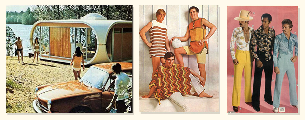
Through various discussions and concepts we narrowed in on the 70’s as our inspiration behind the the art style. The 70’s is a diverse and eclectic decade stylistically. Although colors used a somewhat muted, earthy palette, they were used extensively, and mixed with some outlandish and exuberant design choices. This colorful exterior, mixed with the political and social unrest matched our first goal perfectly.
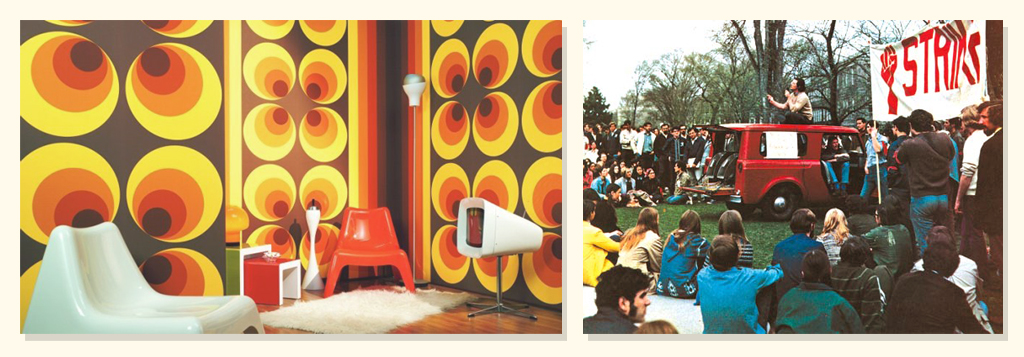
For our second goal, some of the more absurd and fanciful designs from fashion to architecture were perfect for creating a light hearted and fun aesthetic.
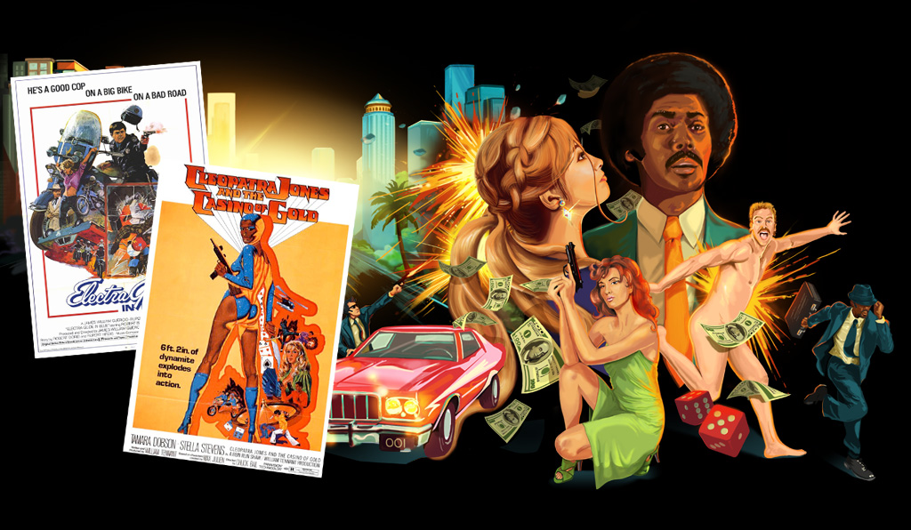
70’s cop shows like Starsky and Hutch, Hawaii Five-0, and Charlie’s Angels, gave us plenty of reference for parody, and early concepts to generate the mood/tone were based around 70’s movie posters.
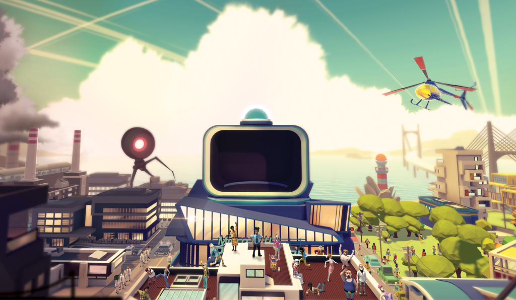
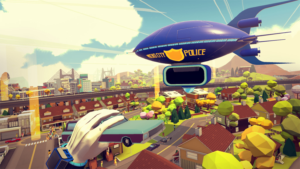
As the project continued we would narrow in on more specific graphic designs/color palettes/architecture from the era to continuously refine the art style. Micro City is an imaginary/alternate world with a narrative that comments on current political and social issues, so we aren’t bound by the rules of the era. We are using the time period as a way to create a focused and unified style that feels coherent and familiar, but also imaginary and unique.
Low Poly:
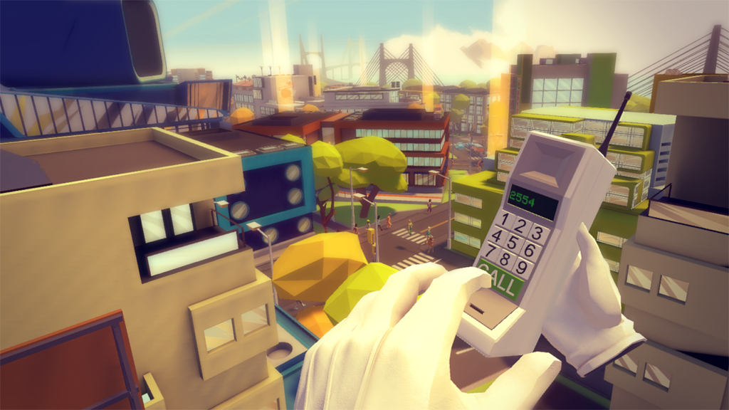
While the low poly style has allowed us to create a living breathing city within the technical constraints of virtual reality, the team had decided on this style back when it was a mouse and keyboard pc demo. Both low poly and pixel art have had a resurrection in recent years due to a mix of their aesthetic qualities and nostalgic draw.
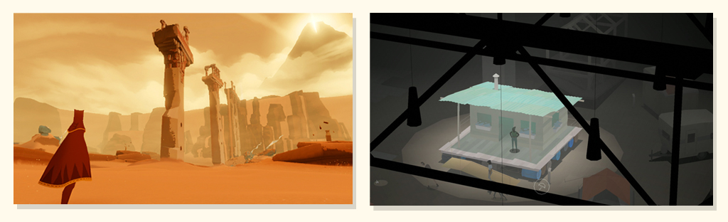
The same simplicity and elegance that have moved to the forefront of graphic design is evident in a multitude of contemporary games, such as Journey, Kentucky Route Zero, and Monument Valley. These self-imposed artistic limits are useful as they allow us to create a more refined art style.
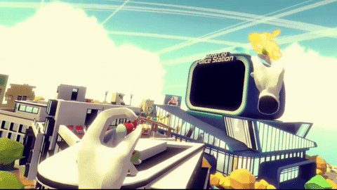
Another great aspect of the low poly style is the humour it allows. Watching a crowd of pedestrians get sent flying through the sky when you throw a car at them would feel entirely different if the pedestrians were realistically styled. Referring back to our initial guidelines, we felt picking up and throwing tiny stylised people had just the right mix of enjoyment and guilt.
This mix of retro and modern is the main theme that runs throughout our art direction. Combining low poly style with contemporary methods, the latest tech, and 70’s influence has allowed us to create something that is visually compelling and funny.
In future posts we’ll go into more detail on the techniques & technology we used to create the characters, buildings, vehicles, and environments of Micro city.